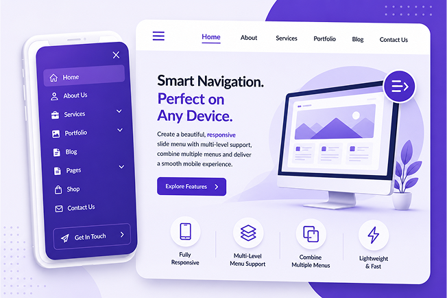
Create Beautiful Mobile Navigation with LR Responsive Slide Menu
Deliver a seamless mobile browsing experience with a responsive slide menu that looks great on every device. Add multi-level navigation, combine multiple menus, and enhance your website's usability without writing a single line of code.
Modern websites need intuitive mobile navigation. LR Responsive Slide Menu helps you create a clean, responsive slide-out menu that improves user experience, simplifies navigation, and works perfectly across devices and browsers.
Quick and easy setup
Mobile-friendly navigation
Clean slide-out menu design
Works with most WordPress themes
Smooth user experience
Fast and lightweight
Key Features
Create a smooth and responsive slide-out navigation menu that enhances your website's mobile experience. Easily manage multi-level menus, combine multiple WordPress menus, and add modern navigation to any website no coding required.
Fully Responsive Design
Automatically adapts to mobile, tablet, and desktop screens for a consistent navigation experience.
Multi-Level Menu Support
Create organized navigation with expandable submenus for better usability.
Combine Multiple Menus
Merge multiple WordPress menus into a single responsive slide menu.
Lightweight & Fast
Optimized for performance to deliver smooth animations and fast loading.
Cross-Browser Compatible
Works seamlessly across Chrome, Firefox, Safari, Edge, and other modern browsers.
Easy Integration
Add the responsive slide menu to your website with a simple shortcode and minimal setup.
Discover our growing collection of professionally built WordPress plugins designed to improve functionality, boost engagement, and simplify website management. Whether you're running a blog, business website, or WooCommerce store, we have the right tools for you.
Banner Image for post and page
Add beautiful banner images to your posts and pages with ease.